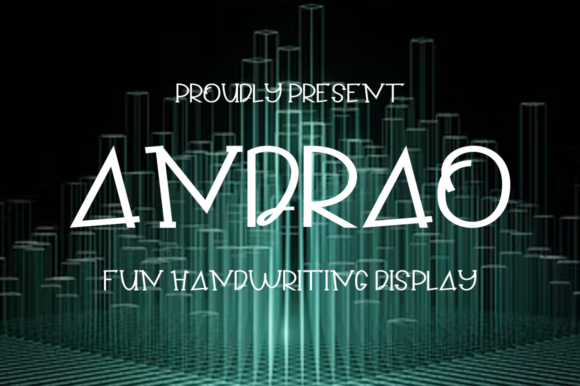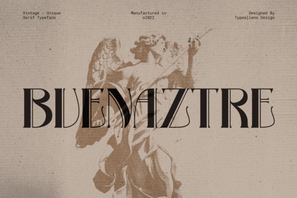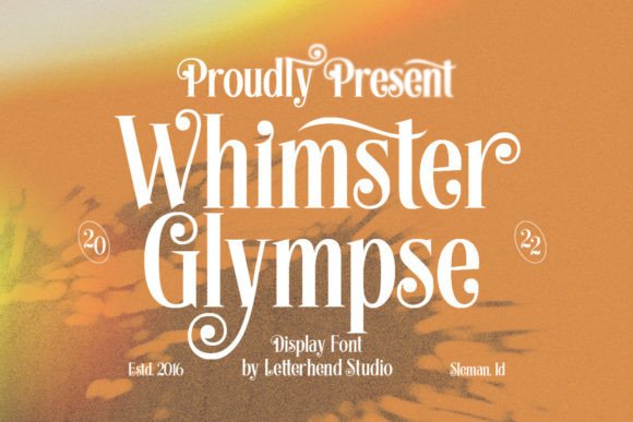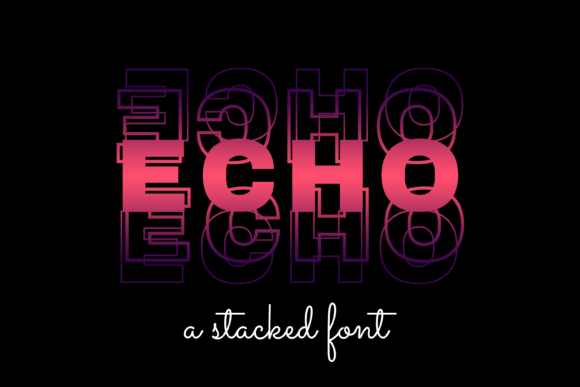
Arman: A Display Font That Earns Its Space
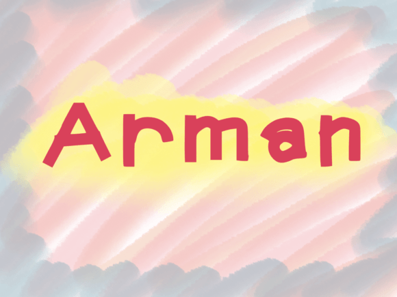
First glance at Arman isn’t about instant love—it’s about immediate recognition. This isn’t a shy typeface hiding in the background. It’s bold, confident, and quietly architectural: sharp terminals, subtle flaring, and a rhythm that feels both grounded and elevated. The letterforms carry weight without heaviness—no forced drama, no hollow ornamentation. Arman breathes like a well-designed logo mark: intentional, memorable, and built for presence. It leans modern but avoids trend-chasing; it feels timeless because it prioritizes structure over flash.
As a display font, Arman doesn’t pretend to be your body text. It’s not meant for paragraphs, captions, or footnotes—and trying to force it there undermines its strength. Instead, Arman excels where impact matters most: in logo design, on product packaging, across event posters, and as the focal point of social media graphics. I’ve used it for a small-batch ceramic brand’s monogram lockup—its clean geometry echoed the precision of hand-thrown forms. It worked equally well on a limited-edition book cover in editorial design, where it anchored title hierarchy without shouting over delicate serif body copy.
In brand identity work, Arman performs best when paired with restraint. It’s a strong lead voice—not a solo act. On packaging design, it shines on front-facing labels: think apothecary bottles, artisan chocolate bars, or premium skincare. Its uppercase forms hold crispness at 24–48pt on matte stock, and its lowercase (when available in the full family) adds nuance for subheadlines or short descriptors. For printable design like wedding invitations or boutique flyers, Arman delivers elegance without fuss—no excessive contrast or fragile details that break down in offset or digital print.
Where does it land in digital spaces? Very well—if used intentionally. As a website header font, it commands attention above the fold. In social media graphics, it cuts through feed noise, especially against muted or textured backgrounds. I’ve embedded it in Canva templates for coaches and creatives—always as the primary headline, never as supporting text. For digital product assets like downloadable planners or Cricut-ready SVG files, Arman scales cleanly and renders consistently across browsers and devices. Just avoid using it below 20px on screen—even with solid hinting, its display DNA shows.
Readability isn’t Arman’s mission—but legibility *at scale* absolutely is. At headline sizes (36pt+), every character reads cleanly, even in tight tracking. Its x-height is generous, counters are open, and spacing feels considered—not tight enough to blur, not loose enough to feel disconnected. That said, don’t test it on a business card tagline at 8pt. It won’t cooperate. And while it handles short quotes beautifully (“Crafted with care”, “Est. 2019”), avoid multi-line pull quotes unless tightly controlled and generously spaced.
Brand consistency benefits from Arman’s reliability: once chosen, it rarely needs tweaking. It doesn’t shift mood depending on color or layout—it holds its tone. That builds audience trust: when customers see Arman on a website banner, then on a tote bag, then on an email header, the visual thread feels deliberate, not accidental. Recognition sticks because Arman has personality *without* quirkiness—it’s distinctive, not distracting.
Engagement rises when typography supports intent—not competes with it. Arman elevates perceived value. Used on premium packaging or high-end service landing pages, it quietly signals quality. But it can also energize playful brands—especially when paired with a warm handwritten font for contrast or a clean sans serif font for balance. It’s not inherently “luxury” or “youthful”; it’s adaptable, provided you respect its role.
Here’s what I do before committing Arman to client work:
- Test it in black and white first—no color crutches. Does it still hold shape and contrast?
- Render it at actual size on real mockups: a Shopify product page, a sticker sheet, a fabric swatch. Screen previews lie.
- Compare uppercase vs. lowercase usage. Some weights include both; others are caps-only. Know which version you’re licensing.
- Review kerning pairs manually—especially common combos like “To”, “AV”, “Wa”. Adjust if needed; don’t assume auto-kerning is enough.
- Pair it live: beside a sturdy serif font for editorial balance, a neutral sans serif font for UI clarity, a light script font for contrast, and another display font to confirm it doesn’t clash tonally.
- Confirm commercial licensing. Arman is a premium font, and many designers overlook embedding rights for web or resale in templates. Check the foundry’s terms—especially for digital product or design assets you plan to sell.
Arman isn’t a “fix-all” creative font. It won’t rescue weak concepts or compensate for poor layout. But in the hands of a designer who understands modern typography, it becomes a quiet collaborator—elevating intention, reinforcing voice, and grounding a brand in visual certainty. It works hardest when you let it do one thing exceptionally well: stand out, with dignity.
Use it for logos that need to last. For packaging that must catch eyes on crowded shelves. For social posts where three seconds is all you get. For merchandise that feels worth holding. For invitations that signal occasion. For flyers that stop scrollers mid-feed. For posters that anchor a room. For blog graphics that make readers pause before scrolling past.
Just don’t use it everywhere. Let it breathe. Give it space. Respect its category. Arman earns attention—not by demanding it, but by deserving it.